I am very thrilled to introduce you the new look of PracticalMama.com. Practicalmama.com had a very much needed facelift a while ago, at the beginning of February. Many structural improvements came along with that facelift. I have been working on those updates and revisions to make it easier for my readers access what information they needed since then. In my day job, improvement is continuous and never ending. Therefore, I am introducing you the new version, acknowledging that there is always room for more improvement.
First and foremost, I’d like to thank Laura at PixelMeDesigns.com making the redesign project a breeze. She has a foolproof design process. With the help of her questionnaire, I worked on my vision and did a lot of research both on visual as well as the functional aspects of the website.
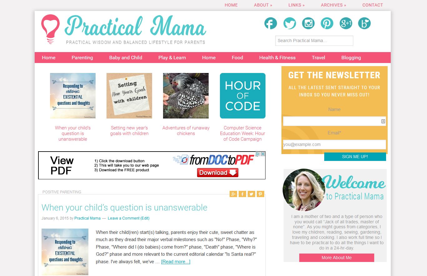
We started with the new colors. I wanted a clean design with few bright colors. I went through every color mood board that is pinned on Pinterest and collected the ones I likes on my color inspirations board. From there, we took a stab at the logo and the font. I wanted a simpler logo compared to my previous one. I don’t know what else to say, other than “she nailed it”.
 vs.
vs. 
Working on the fonts of the banner took longer than the logo. Laura provided me with a number of examples based on my description. I decided on a single color, single font vs. multi-color, multi-font blog name as I had initially planned. I kept the banner as short as possible to make space for valuable content above fold.
Most important improvement on Practical Mama is the main menu. New Main Menu is now working without shifting up or down. Drop down menu works without glitches. I’ve revised my categories. That required a lot of work update in my posts. It was all worth it because they are better organized for you find what you want, easier and faster now.
I moved my pages to the top menu. You can find more about me and the blog and find a post that you are looking for based on date, category or tag. Search box is right at the top, on the right side of the banner space if you want to look up a specific keyword.
New side bar starts with an invitation to subscribe to my weekly newsletter. You can still add PracticalMama.com to your reader such as feedly or bloglovin. RSS subscription is not as practical and user friendly anymore. By subscribing to my weekly newsletter, you will make sure you’ll get the inside scoop directly to your inbox without having to dig up your social media feed.
You can find highlighted posts based on popularity or seasonality on my side bar as well.
If you are visiting PracticalMama.com from your smartphone or tables, you will notice it’s mobile responsive but not in a B&W WP-widget way. New mobile responsive design helps you, readers, easily access PracticalMama.com, while keeping the visual integrity of the new design.
If you are thinking about redesigning your website and looking for a skilled, reliable and quality designer, look no further than Laura at Pixel Me Designs. She is very easy to work with. She completed this project so fast that, in fact, I hard time keeping up with her to review her mock designs and revisions. She sets the expectations right. Do you homework and leave the rest to Laura. She’ll get it done.
I hope you like the new design. Now that the blog redesign is done to make it easier for you to find, read and share, I’ve left with one very important task: to continue filling my blog with great content, that is valuable and useful to you. Don’t forget to subscribe to my newsletter to keep up to date and have practical tips and come directly to your inbox.
I would love to hear your feedback about this new design. Definitely let me know if you find something that is not working properly. Also feel free to ask any questions about the design process, if you are thinking about designing a new blog or redesigning an existing one. I would be glad to help, in any way that I can.


Leave a Reply